 |
| Album Cover |
 |
| Insert |
 |
| CD |
 |
| Back Cover |
 |
| Magazine Advert |
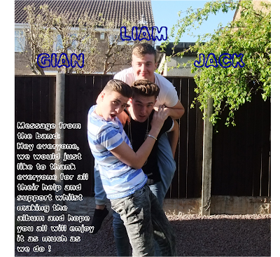
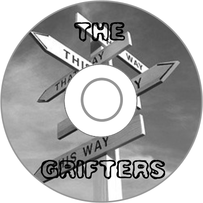
This is my final digipack consisting of an album cover, insert, Cd, back cover and magazine advert.
As mentioned in an earlier post I had an audience feedback session where we chose the photo that would be used for my album cover- because they weren't looking at the camera straight on it followed with the title of their debut song and album.
The photo for the insert was chosen as it isn't too serious so it injects a bit of a comical atmosphere that was created in the music video.
The Cd itself, I decided that grey tone would go well rather than colour as the image itself again follows the song and album title but I didn't want anything to flashy.
The back cover was done purely for a humorous effect, the fence provided a good base to put the song titles on.
The magazine advert- the photo was chosen by my peers as it is from the same photo shoot that the album cover was from so this can create an association and a brand identity for the band. I decided to base my magazine advert off of a Paramore advert- they went down the non-convectional route of doing a landscape advert rather than the conventional portrait, I believe that because it is out of the ordinary that my band will get more attention because of it.
No comments:
Post a Comment